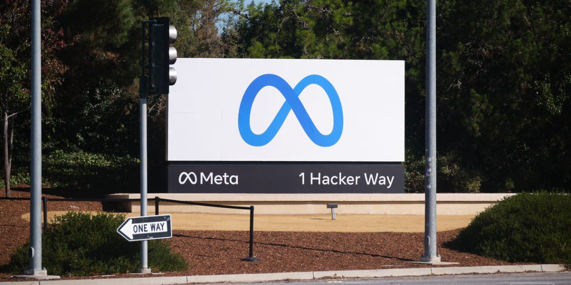
Facebook just announced that it will change its company name to Meta. The new name comes with a new logo, a blue M that looks kind of like a pretzel, and now that logo has replaced the iconic thumbs-up Like icon at the company’s global headquarters in Menlo Park.
Here are two more images of it, taken by The Verge’s own Vjeran Pavic:
:no_upscale()/cdn.vox-cdn.com/uploads/chorus_asset/file/22964006/verge_vjeran_pavic_meta_20211028_2_3000.jpg)
:no_upscale()/cdn.vox-cdn.com/uploads/chorus_asset/file/22964003/verge_vjeran_pavic_meta_20211028.jpg)
For comparison, here’s what the old sign looked like:
:no_upscale()/cdn.vox-cdn.com/uploads/chorus_asset/file/22964052/1298876066.jpg)
Photo by Yalonda M James/San Francisco Chronicle via Getty Images
The new sign had been teased ahead of its official reveal. At one point, it was covered in a canvas with the Like icon:
Hmm. The “Facebook Sign” at 1 Hacker Way is covered in a temporary canvas/cover which also shows . Earlier a small security team was putting up a barrier/cordon around it and guards are patrolling ♂️ (Note: did not see the cover go up) $FB #Facebook story @TheTerminal pic.twitter.com/NPUyBoH4v2
— Ed Ludlow (@EdLudlow) October 28, 2021
And a tweet Wednesday evening captured artists painting the new logo:
The new sign represents just how big of a shift the company is trying to make with the change to Meta. “I used to study Classics, and the word ‘meta’ comes from the Greek word meaning ‘beyond,’” Meta CEO Mark Zuckerberg said in a blog post. “For me, it symbolizes that there is always more to build, and there is always a next chapter to the story.” The company also went into great detail about the new brand on a dedicated website.
Facebook’s campus used to be owned by Sun Microsystems, and the company flipped the old Sun sign around when it moved in. Even though the company has switched from the Like icon to the Meta one, that old Sun sign is still there. “The old sign remains as a reminder of what happens when you take your eye off the ball,” Time wrote in a Facebook profile from 2014. It seems Meta wants that reminder to stay in place.
:no_upscale()/cdn.vox-cdn.com/uploads/chorus_asset/file/22964081/DSCF7697__1_.jpg)
Credit: Source link


